
Renovations
The Paisley Project: transforming a neglected 1961 California ranch into a timeless family home
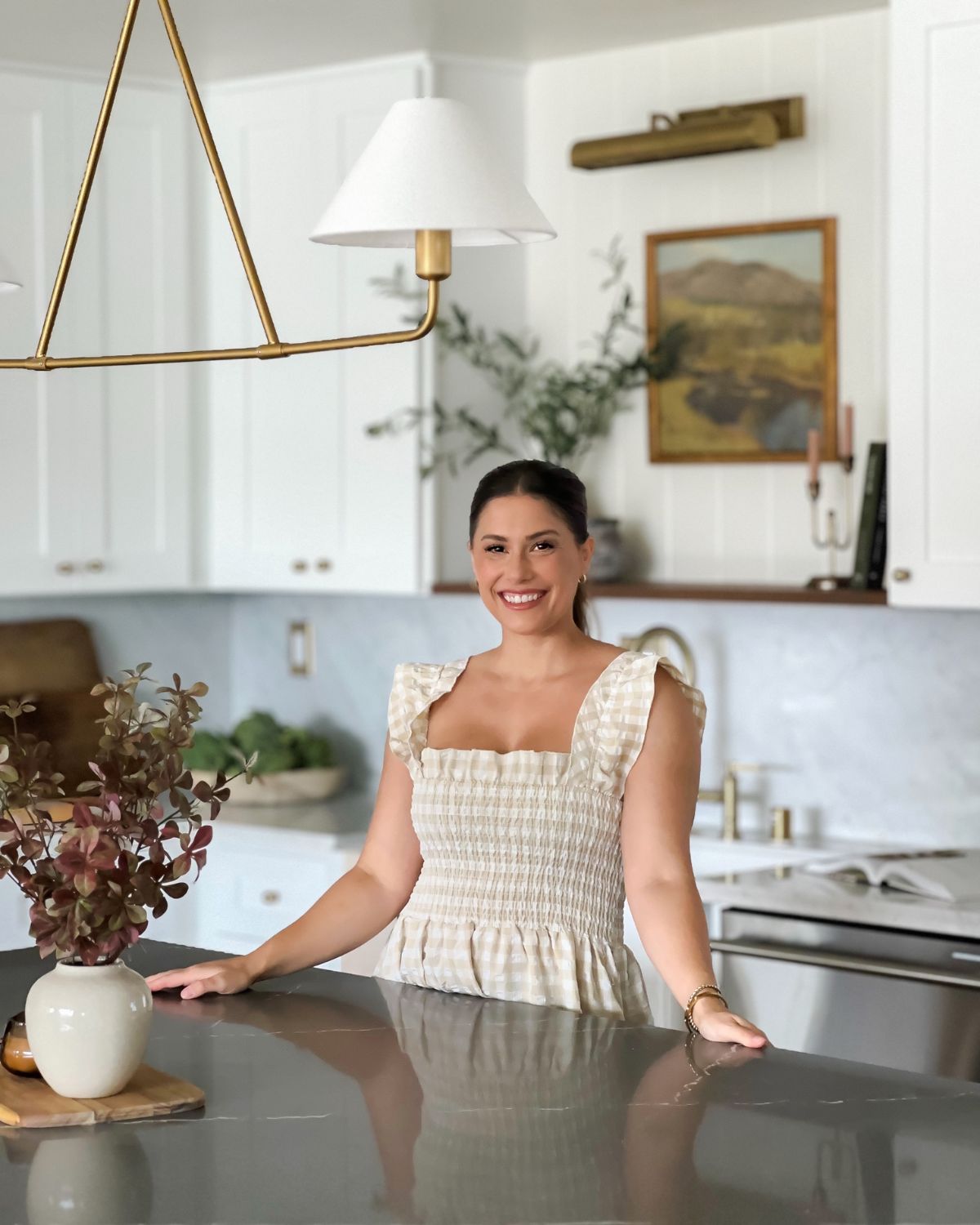
Quick Answer
The Paisley Project is a complete before-and-after renovation of a neglected 1961 California ranch home in San Diego. After spending months navigating a complex off-market acquisition, we transformed the home with a redesigned floor plan, custom kitchen remodel, primary suite addition, three bathroom renovations, garage conversion, backyard makeover, and full exterior renovation. The project invested approximately $234,000 in renovations, received multiple offers, and sold during its first weekend on the market.
Every renovation has a story, but if you’ve followed our renovation projects for any length of time, you’ve probably noticed a pattern.
Ryan and I rarely buy homes that are move-in ready.
In fact, we usually end up purchasing the houses most people won’t even consider—the ones filled with junk, neglected for years, or in such poor condition that they often don’t qualify for traditional financing. They’re the houses that many buyers walk away from before they ever step through the front door.
Those are the projects we’re drawn to.
Not because they’re easy, but because we genuinely love uncovering the potential hidden beneath years of neglect. Every property has its own challenges, but we approach each one with the same question:
What could this home become with thoughtful design and a second chance?
The Paisley Project was no exception.
Before we ever picked up a hammer, chose paint colors, or started designing the kitchen, we spent months navigating the legal process just to gain access to the property. When we finally stepped inside, we found a home that had been overtaken by fleas, filled with abandoned belongings, and burdened by a floor plan that no longer made sense.
At first glance, there wasn’t much to fall in love with. But that’s rarely what we’re looking for…
We’re looking for possibility.
This isn’t just a before-and-after home tour. It’s the complete story behind the renovation—from how we acquired the property to the design decisions, compromises, and lessons learned along the way. My hope is that by sharing not only what we changed, but why we changed it, you’ll walk away inspired to look at homes a little differently, whether you’re planning a renovation of your own or simply love seeing neglected houses transformed into homes people truly want to live in.


How we found this off-market fixer upper
Some houses find you in the most unexpected ways, and this one came with a story unlike any renovation we’ve ever taken on.
Ryan was cold calling homeowners while searching for potential real estate opportunities when he struck up a conversation with a woman who had inherited this property. She wanted to sell the home, but she was facing a difficult situation. Although she was the legal owner, she had been unable to regain possession of the property, which meant selling it through the traditional market simply wasn’t an option.
After several conversations, she agreed to sell us the house below market value if Ryan was willing to take on the lengthy legal process required to regain possession before the renovation could even begin.
It wasn’t exactly the kind of renovation story I ever imagined telling.
Over the next several months, there were attorneys, court appearances, paperwork, and more waiting than I care to remember. By the time everything was finalized, we technically owned the property—but neither of us had ever stepped foot inside.
As someone who loves walking through a house before designing it, studying the natural light, noticing the architectural details, and imagining how each space could evolve, it felt incredibly strange to commit to a renovation based almost entirely on possibility.
There’s another part of this story that people often find surprising.
We didn’t have the capital to purchase the property ourselves.
Ryan initially intended to pass the opportunity along to one of his investors, but after running the numbers, we realized this was a project we didn’t want to let go. Instead, we partnered with an experienced investor who believed in the opportunity as much as we did. He provided the funding for both the purchase and renovation, Ryan sourced the deal, managed the acquisition, and ultimately sold the finished home, while I was responsible for the entire design vision from start to finish.
It became a true partnership that allowed us to take on a project that otherwise wouldn’t have been possible.
Eventually, we got the call we’d been waiting for. The house was finally ours.
If you’re curious about everything that happened behind the scenes—including how Ryan found the property, how we structured the partnership, and what it took to finally regain possession—you can read the full story over on Lovery Real Estate. For this post, I want to focus on what happened once we finally opened the front door. Because that’s where this renovation really begins.
Walking through the house for the first time
When we finally got the keys, I couldn’t wait to see the house we’d spent months fighting to access.
That excitement lasted about thirty seconds.
The flea infestation was unlike anything I’d ever seen. You could actually watch the fleas jumping onto your legs the moment you stepped inside. There was no such thing as taking a quick walkthrough—you needed to be completely covered from head to toe just to enter the property.
I refused to walk through the house until it had been professionally treated.

Only after the fleas were finally gone was I able to take my first real look at what we’d purchased.
Even then, seeing the house wasn’t easy.
The previous occupants had left behind an unbelievable amount of trash, damaged the property, and vandalized parts of the home. We filled two full construction dumpsters before demolition had even begun.
The sheer amount of clutter made it almost impossible to understand the space itself. Every room was buried beneath years of belongings, debris, and damage.

As a designer, I usually start imagining possibilities the moment I walk into a house. This time, I couldn’t even see the house. Not until everything was cleared away. Only then could I finally begin evaluating the floor plan and imagining what it could become.

Redesigning the Paisley Project floor plan
Once the clutter was gone, the biggest problem became obvious.
It wasn’t the outdated finishes… It wasn’t the plumbing… It wasn’t even the amount of work ahead of us…
It was the layout.
At first glance, the home actually seemed like it had everything going for it. A previous owner had enclosed the back patio, creating a large addition that gave the house significantly more square footage than most homes in the neighborhood.
But instead of making the home feel larger, the addition made it feel disconnected.
Because the patio had simply been enclosed, remnants of the original exterior were still visible inside the house. One of the most awkward examples was in the kitchen, where the original exterior kitchen window had never been removed. Instead, it looked straight into the addition, creating what essentially felt like an interior window between two rooms. It was one of those details that immediately made the house feel pieced together rather than intentionally designed.
The addition also created a bonus room at the back of the home, but the only way to reach it was by walking through one of the original bedrooms. The circulation throughout the house simply didn’t make sense.
Ironically, the house had plenty of square footage. It just wasn’t functioning the way a home should. That became the real design challenge.
The goal wasn’t to make the house bigger. It was to make it feel like it had always been designed this way.


Designing a home that finally had personality
One thing that kept coming back to me as I walked through the house was how… forgettable it felt. This wasn’t a historic home with beautiful original details waiting to be uncovered. It wasn’t a charming cottage with architectural character. It was a very typical Southern California suburban home built in 1961.
A flat roof. No garage. A simple rectangular footprint. Inside, it was just as plain. The house didn’t have a single architectural feature that made you stop and look twice. It was simply… there. And to me, that was the biggest opportunity.
The house didn’t just need updated finishes. It needed personality. It needed warmth. It needed architectural interest. It needed details that made someone pause as they walked through the front door and notice something they hadn’t seen before.
That philosophy guided every decision I made throughout this renovation.
I wasn’t interested in chasing trends or creating something that felt flashy. Instead, I focused on adding layers of timeless character—details that would quietly elevate the home without overwhelming it.
Tongue-and-groove paneling.
Real Carrara marble.
Crystal doorknobs.
Warm satin brass hardware.
Painted trim and doors.
Thoughtful millwork.
Individually, none of these details are dramatic. Together, they completely changed how the house felt.
My goal was never for someone to walk in and say, “Wow, look at that backsplash.” I wanted them to walk in and think, “This house just feels really special.” And maybe not even be able to explain exactly why.
Once the house was cleaned out and we could finally see the structure underneath, I spent a couple of weeks studying the floor plan while the demo was underway before making a single design decision.
One question guided almost everything that followed:
How could we make this house feel like it had always been designed this way?
That meant rethinking the layout before choosing finishes, improving the way each room connected, and looking for opportunities to add architectural character to a home that originally had very little of it. Only after the floor plan was finalized did I start selecting materials, cabinetry, lighting, and finishes. With the overall vision in place, it was finally time to start bringing each room to life.
The Paisley Project kitchen renovation

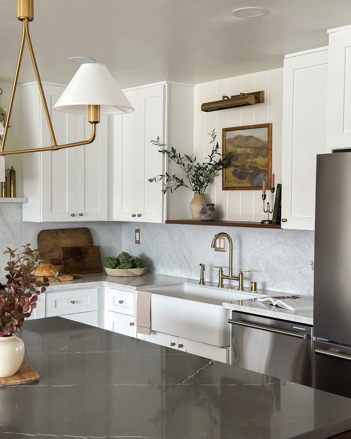
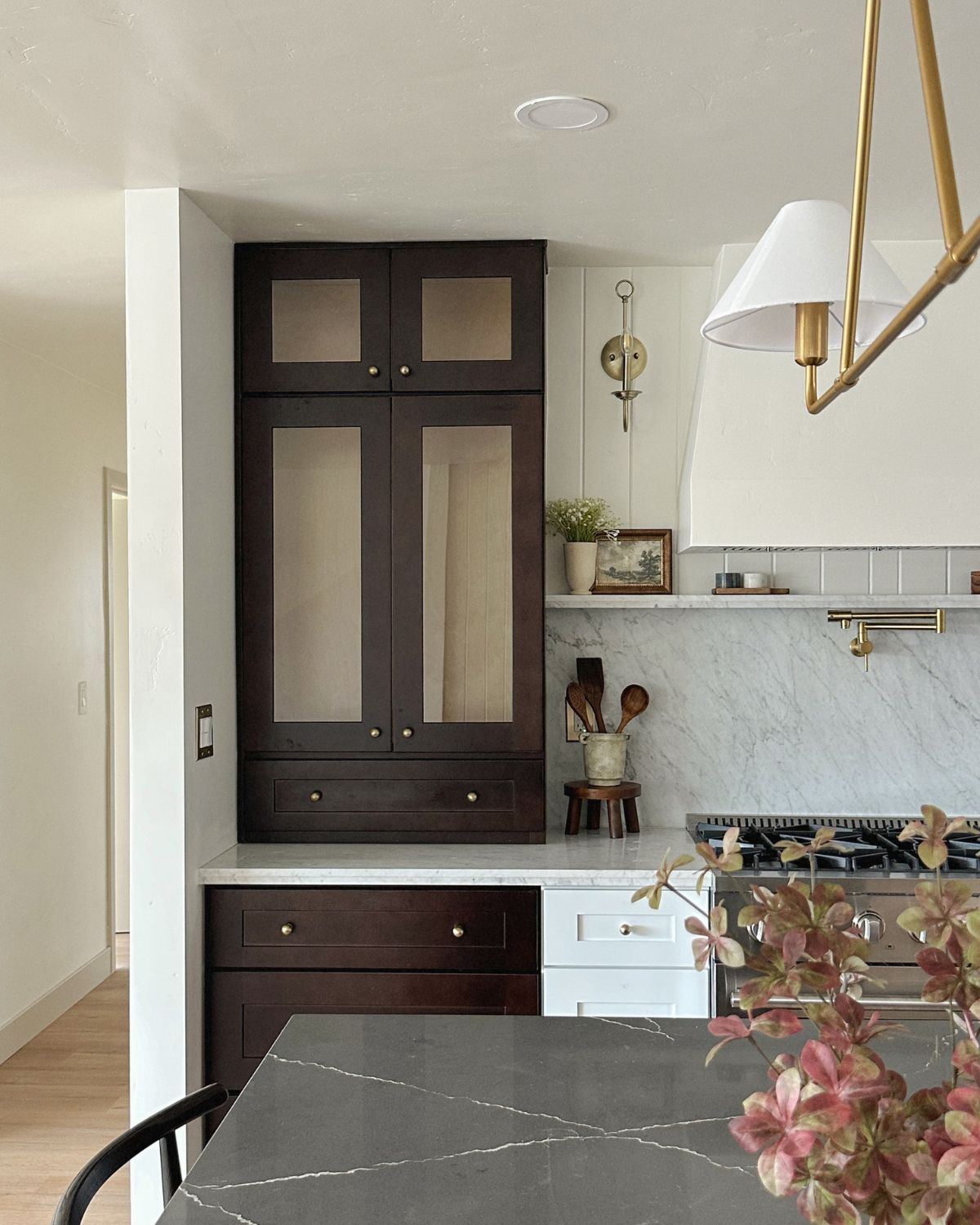
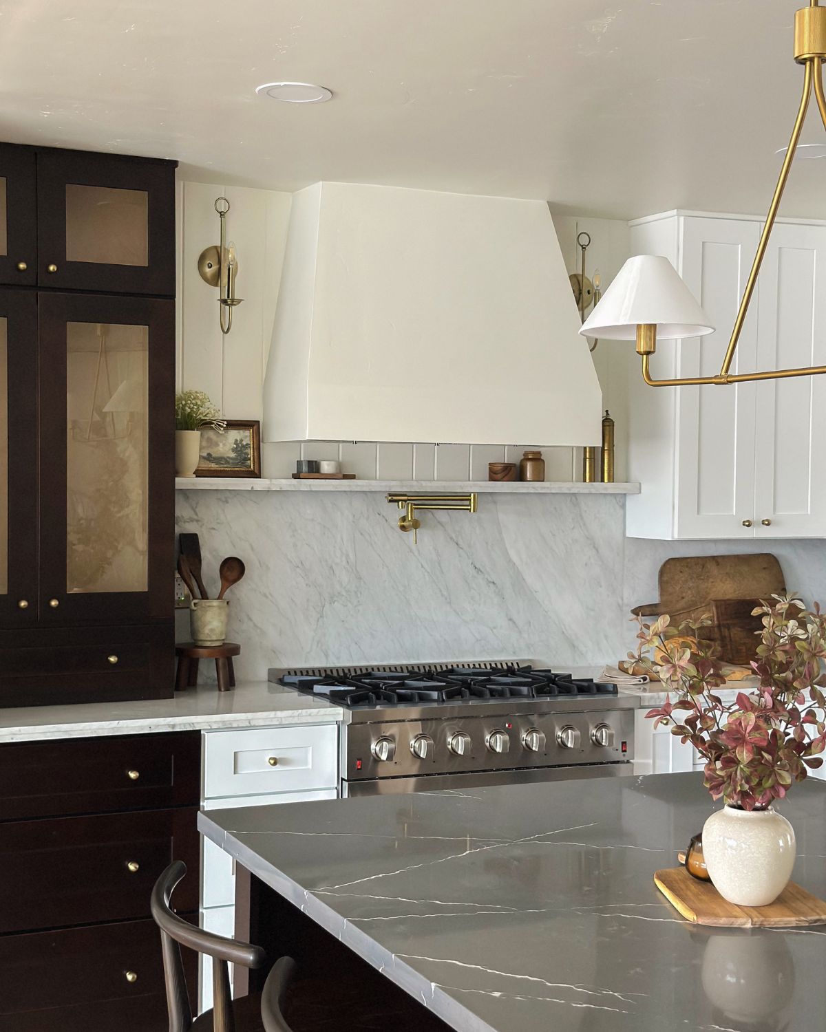
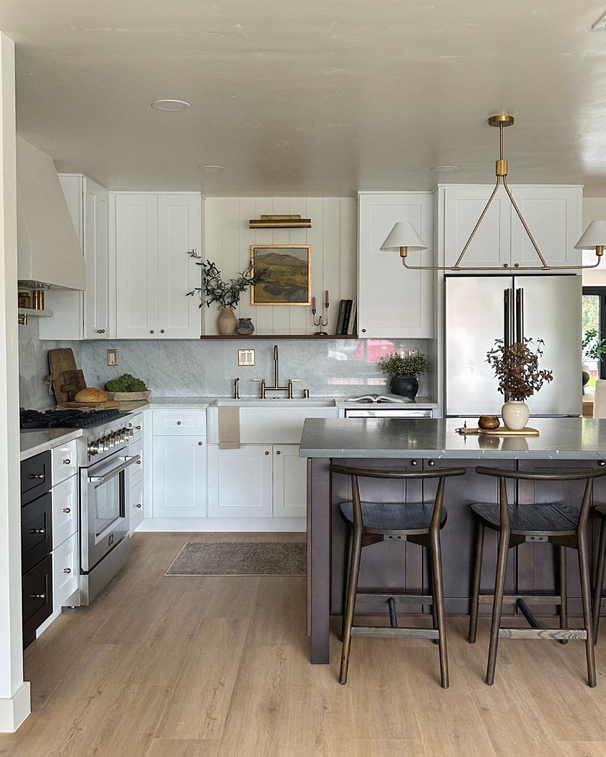
If there was one room that had the potential to completely transform this house, it was the kitchen.
The original kitchen sat right in the middle of the house with two sizable living spaces on either side. On paper, that might not sound like a problem, but because of the way the addition had been built years earlier, the kitchen had very little natural light, the traffic flow felt awkward, and it simply wasn’t the most functional layout.
The first thing I knew I wanted to do was open the wall between the kitchen and front living room. Not only would it bring much-needed natural light into the center of the house, but it would also create a much more inviting connection between the two spaces. Once we determined the wall could be removed and the structural changes made sense, everything else started falling into place.
Before I start choosing cabinet colors or countertop materials, I always spend time designing the layout first. One of the first things I do on every renovation is build the space in SketchUp so I can experiment with different layouts before construction ever begins. It allows me to see the room in three dimensions, study the paths of travel, and make sure the space will function well before making expensive decisions.

For this kitchen, I debated between adding a peninsula or a large island. A few of the biggest things I consider when designing a kitchen are how people naturally move through the space and where the primary workstations will be. Those two things have a huge impact on how functional a kitchen feels day to day.
After trying several different layouts, I ultimately decided to extend the remaining kitchen wall by about eighteen inches. It seems like a relatively small change, but it made a huge difference. That extra space allowed us to keep the sink, refrigerator, and range within a comfortable working distance of one another while creating a larger island with seating for three. It also left room for additional cabinetry if we wanted it and maintained a clear path of travel through the house to the back room and primary suite.
Those aren’t necessarily the kinds of decisions someone notices when they first walk into a room. But they’re the decisions that determine whether a kitchen actually functions well.
Choosing materials that added warmth and dimension

Once the layout was finalized, I could finally start thinking about the finishes.
Because the kitchen had become so much larger after opening it up, I knew I didn’t want it to feel like one big room with identical cabinetry and stone. I wanted to create warmth, depth, and visual interest while still keeping the overall palette timeless.
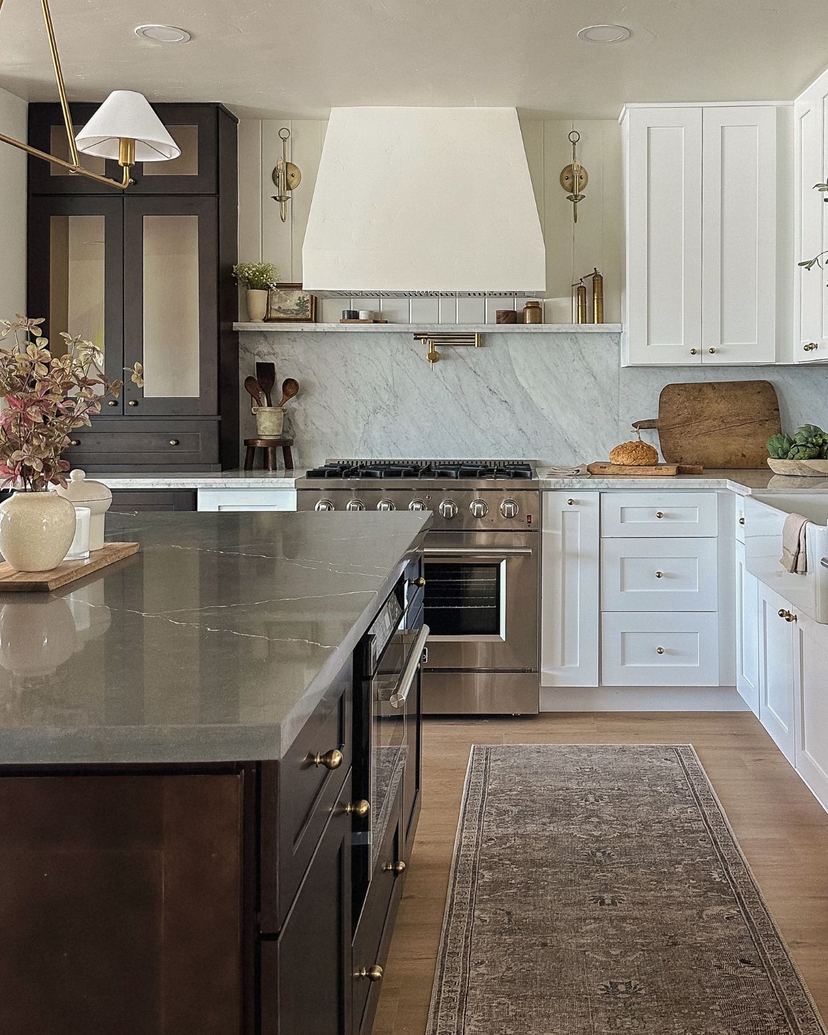
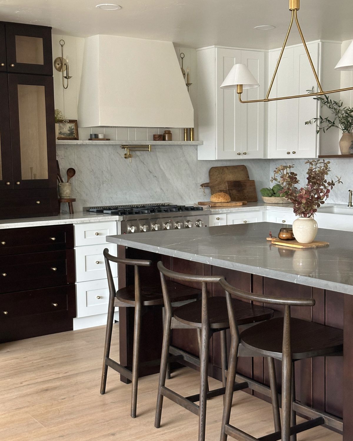
One of the ways I accomplished that was by mixing both cabinetry and countertops. Rather than using one cabinet finish throughout, I paired soft white perimeter cabinets with a warm walnut island and stacked pantry. That contrast immediately helped break up the space and made the island feel more like a piece of furniture than another run of cabinetry.
I carried that same layered approach into the countertops. The perimeter cabinets are topped with real Carrara marble, while the island features Silk Gray quartz. I intentionally paired two different countertop materials to add warmth, depth, and visual contrast. The natural movement of the marble brings timeless elegance and character to the perimeter, while the quartz provides a durable, low-maintenance surface for the island where people naturally gather, prepare meals, and spend the most time.
Mixing materials like this helped break up the large kitchen and made it feel more layered and collected rather than one continuous block of cabinetry and stone. This renovation was also one of the first opportunities I had to really experiment with mixing materials on this scale, and looking back, it’s still one of my favorite design decisions in the house.
The detail I fought the hardest for

As soon as we removed the wall between the kitchen and living room, one challenge immediately became obvious…
We had created one very long wall stretching across the main living space. Without something to visually break it up, the room risked feeling like one oversized open box.
That was exactly why I fought so hard to include the tongue-and-groove paneling.
From a house-flipping perspective, I completely understood why it was questioned. It added labor, took more time to install, and wasn’t necessarily the kind of feature someone would point to and say, “That’s why I bought this house.”
But I wasn’t looking at it strictly from an ROI perspective. I was looking at it as an architectural feature. One of my goals throughout this renovation was to create connected living spaces without losing definition. Rather than relying on walls to separate rooms, I wanted to use architectural details to subtly define each area while still maintaining the openness we had worked so hard to create.
To me, the tongue-and-groove wasn’t just decorative—it was essential. It visually anchored the kitchen, helped define where one space ended and the next began, and introduced the kind of character this house was missing from the beginning.
Rather than stopping at the feature wall, I carried the same detail behind the custom range hood and above the kitchen sink so it felt intentional throughout the space instead of isolated to one wall.
Those are the kinds of details people feel more than they necessarily notice. They may not immediately recognize why the room feels different, but those subtle architectural layers are often what make a home feel warm, timeless, and thoughtfully designed.
Bringing the finishing details together
One of my favorite parts of every renovation is watching all of the smaller decisions finally come together. It’s the combination of those details that gives a home its personality.
Throughout the kitchen, I layered warm satin brass finishes to complement the soft white cabinetry and walnut island. Instead of using standard builder-grade hardware, I chose classic round brass knobs and doubled them up on the drawers instead of installing traditional pulls. It’s a relatively small upgrade, but details like this instantly make cabinetry feel more custom and collected.
Lighting was another opportunity to reinforce that same philosophy. I chose a mix of warm satin brass fixtures with classic silhouettes and subtle traditional detailing. Rather than relying on trendy statement pieces, I focused on timeless designs that feel elevated yet understated. The linear fixture over the island became the primary focal point, while the picture light above the open shelving added another layer of warmth without competing for attention.
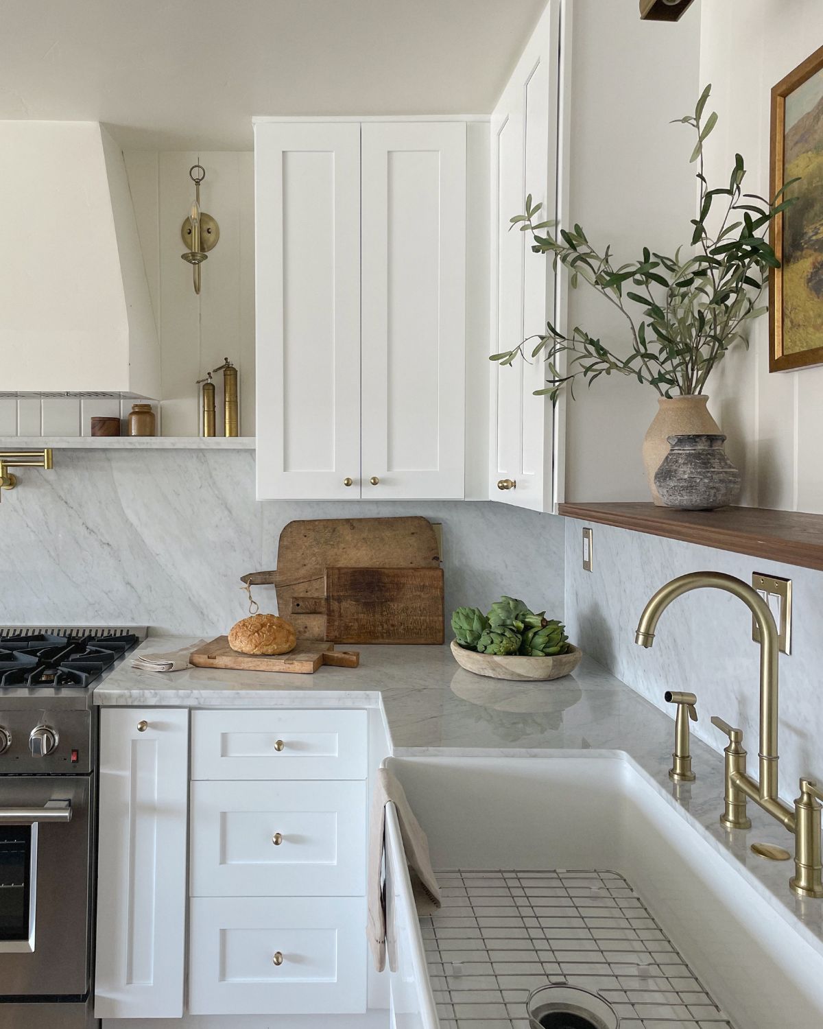
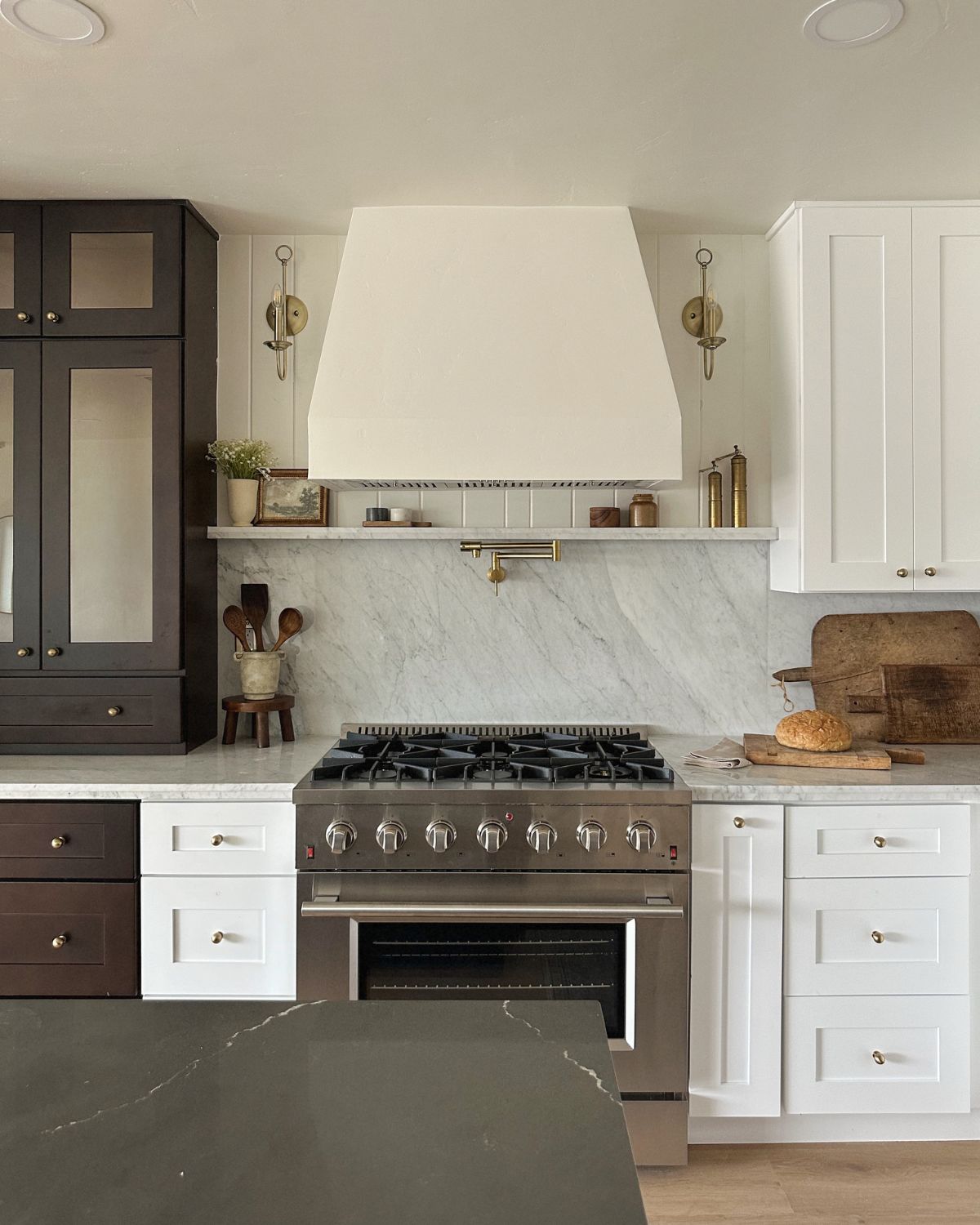
I approached the appliances the same way. Rather than making them the focal point of the kitchen, I wanted them to blend seamlessly into the overall design while still offering the functionality expected in a modern home. We selected a professional-style stainless steel appliance package centered around a 36-inch gas range and incorporated a built-in microwave drawer into the island. It’s one of those features people ask me about all the time because it keeps bulky countertop appliances out of sight while preserving valuable workspace.
Looking back, I think what I love most about this kitchen isn’t any one individual finish. It’s how all of the decisions work together—the mixed cabinetry, the layered countertops, the tongue-and-groove detailing, the warm brass, the marble, the lighting—none of them are trying to compete with one another. Each one quietly supports the next, creating a kitchen that feels warm, timeless, and full of character without relying on a single dramatic statement.
For me, that’s what good design is all about.
Kitchen finish details
Cabinetry: Perimeter: soft white shaker (factory finish) • Island: walnut • Pantry: walnut stacked with glass fronts
Countertops: Perimeter: Carrara marble • Island: Silk Gray quartz
Hardware: 1” Vintage Ball cabinet knobs, brushed satin brass • Pot filler: brushed gold • Faucet: brushed gold
Lighting: Island: linear brass pendant • Range wall: antique brass sconces, 5”×16” • Open shelving: picture light
Appliances: 36” professional stainless gas range • Built-in microwave drawer in island
Details: Custom range hood • Marble shelf above range backsplash • Brass outlet covers • T&G behind range hood, above sink, dining accent wall • T&G + trim paint: Even Better Beige (Behr) • Walls/ceilings: Swiss Coffee (Behr)
Flooring: Pergo Sandy Cove Oak (used throughout the home)
Shop the Renovation
Find the exact fixtures, hardware, vanities, and finishes from the Paisley Project in the Lovery renovation shop.
The Paisley Project primary suite renovation


If the kitchen was the heart of this renovation, the primary suite was probably the biggest transformation.
A previous owner had enclosed the back patio years earlier, creating a large addition that dramatically increased the home’s square footage. While the extra space was a huge advantage, it also left us with one of the most awkward areas in the house.
At the back of the addition was a large bonus room that never really had a clear purpose. It wasn’t connected to a bathroom, it didn’t have a closet, and because of the way the house had evolved over time, one of the original bedrooms had become the only way to access it.
It never truly felt like part of the home. One of my biggest priorities was changing that.
Rather than treating the bonus room as an afterthought, I saw it as an opportunity to create something every buyer hopes to find—a true primary suite. That meant thinking beyond finishes and asking how the space should actually function: Where should the bedroom be? Where does a bathroom naturally fit? How can we create a walk-in closet without making the bedroom feel cramped? How do we make this feel like it had always been designed this way?
Those questions shaped every decision that followed. The finished layout includes a spacious bedroom, a dedicated walk-in closet with a skylight, and a brand-new ensuite bathroom, all carved out of what had once been one oversized, undefined space.
And now, it’s hard to imagine the house any other way.
Designing the primary bathroom
Once the layout was finalized, I could finally start designing one of my favorite spaces in the house. I wanted the primary bathroom to feel calm, timeless, and quietly elegant. Rather than relying on one dramatic statement piece, I focused on layering thoughtful details that would work together to create something that felt custom and collected.

Choosing a vanity worth investing in
One of the best examples of that philosophy is the vanity. There was another option on the table that would have saved us roughly $1,000 across all three bathrooms. From a house-flipping perspective, that felt like a meaningful savings, and I completely understood why it was being considered.
Functionally, either vanity would have worked. Visually, they couldn’t have been more different.
The vanity we ultimately chose felt like a piece of furniture rather than a standard built-in cabinet. The gently rounded corners, exposed tapered legs, warm walnut finish, real Carrara marble countertop, and simple oval brass hardware all worked together to create something that felt lighter, more refined, and much more custom.
Could we have saved the money? Absolutely. But if there’s one thing renovating multiple homes has taught me, it’s that not every upgrade delivers the same visual impact. Spending roughly an extra $1,000 across all three bathrooms dramatically elevated spaces people interact with every single day. For me, that was one of the best investments we made during the renovation.


Designing the shower tile
The tile design became another opportunity to introduce character while also solving a problem. My original vision actually looked very different. Initially, I had planned to wrap nearly the entire shower in the deep green tile. I loved the richness it brought to the space and thought it would create a beautiful, moody backdrop.
But as construction progressed, another design decision started influencing the room. Because we ultimately decided not to enlarge the existing window, I knew the bathroom wasn’t going to receive nearly as much natural light as I had originally planned. It was one of those moments where I had to stop designing the bathroom I wanted on paper and start designing the bathroom that actually made the most sense for this house.
Rather than wrapping the entire shower in green tile, I pivoted to glossy white vertical field tile to reflect as much natural light as possible. I then carried the original green tile around the bottom perimeter of the shower, creating a subtle architectural border that ties beautifully into the green stone accents in the marble mosaic floor.
Looking back, I actually think the bathroom is stronger because of that change. The white tile keeps the room feeling bright and airy, while the green border adds depth and visual interest without overwhelming the space. It also creates a subtle connection between the shower, the floor tile, and the walnut vanity, helping the entire room feel cohesive rather than like a collection of separate materials.
It was another detail that was questioned during construction because it required additional planning, more cuts, and more labor. For me, though, those quieter details are often what give a home its personality. The green border isn’t the first thing your eye is drawn to when you walk into the room—and that was exactly the point. I wasn’t trying to create a bold statement. I was trying to create balance. It’s a subtle detail that anchors the room and gives it a greater sense of completeness.


Designing within a budget
Of course, not every design idea made it through construction. Originally, I had also planned to continue the tongue-and-groove detailing onto the wall behind the vanity and toilet. Since tongue-and-groove became such an important architectural element throughout the kitchen and front room, I loved the idea of carrying that same language into the primary bathroom.
Ultimately, though, this was one detail I agreed to let go. Between the additional labor, material costs, and installation time, it became one of those places where simplifying the design made more sense for the overall budget.
The same was true of the shower window. My original plan was to enlarge it slightly and center it perfectly on the shower wall. From a purely aesthetic standpoint, I still think that would have been the stronger design. But reframing the opening would’ve required significantly more construction, exterior work, and cost than I felt was justified.
That’s the reality of renovating. Every project involves tradeoffs. Part of being a designer isn’t getting every single idea you originally envisioned. It’s knowing which ideas are worth protecting and where it’s okay to adapt. In this bathroom, I’d much rather preserve investments like the furniture-style vanity, the real Carrara marble, and the thoughtful tile work than insist on moving a window a few inches or forcing every original detail into the final design.
In hindsight, I wouldn’t change those decisions. This project reinforced something I’ve come to believe after renovating multiple homes: good design isn’t about refusing to change your mind. It’s about knowing when changing your mind creates an even better result.
Primary bathroom finish details
Vanity: 60” cinnamon oak double (furniture-style, gently rounded corners, exposed tapered legs) • Sink faucets: brushed gold, 8” widespread (2) • Mirrors: brushed gold, 25”×38” (2) • Light fixtures: brass with milk white glass (2) • Shower faucet: solid brass • Shower tile border: sage ceramic, 3”×12”, vertical • Shower tile field: meringue glossy ceramic, 3”×12”, vertically stacked, white grout • Floor + shower floor: Maverick Green Thassos polished marble mosaic, 12”×12” • Towel hooks/rings: gold • Skylight
Living spaces renovation
Choosing paint colors that added soft contrast


One of the questions I get asked most often is why I didn’t simply paint everything white.
When you’re renovating a home to sell, it’s very common to choose white walls, white trim, and white doors because it gives potential buyers a blank canvas to imagine their own furniture and style in the space. Normally, I completely understand that approach. For this house, though, it felt too stark.
Because the home didn’t have much architectural character to begin with, I worried that an all-white interior would make it feel even flatter. Instead, I chose Behr Swiss Coffee for the walls—one of my favorite whites to use in interiors because it’s warm, soft, and incredibly versatile. For the trim, baseboards, doors, and tongue-and-groove feature wall, I used Behr Even Better Beige, one of my favorite neutrals.
The contrast is subtle enough that many people won’t immediately notice it, but that’s exactly what I wanted. Rather than creating bold contrast, the slightly deeper trim color quietly frames each room, gives the millwork more presence, and helps break up the long walls without feeling busy. It’s another example of how small details can have a surprisingly big impact.
Designing flexible living spaces


One of the biggest advantages of the addition was how much flexibility it created. Once we reworked the floor plan, the large room beyond the kitchen became a bright, open living area that could function in several different ways depending on the needs of the homeowner.
For staging, we chose to furnish it as a dining space because it naturally connected to the kitchen and backyard. But I intentionally avoided installing a dining room light fixture over the table. That was a very deliberate decision. I didn’t want to dictate how the next homeowner should use the room. Depending on their lifestyle, it could just as easily become a second family room, a children’s playroom, a home office, or a large entertaining space. Adding a permanent dining fixture would have visually locked the room into one purpose. Instead, I left the ceiling clean so future owners could decide how the space worked best for them.
I think flexibility is one of the most underrated aspects of good design. A home should support the people living in it—not force them into someone else’s vision.
Strengthening the indoor-outdoor connection


One feature that people ask me about more than almost anything else is the large accordion door leading from the addition to the backyard.
For this project, it made perfect sense. Southern California is known for its mild weather, low humidity, and the kind of year-round climate that naturally encourages indoor-outdoor living. Opening that entire wall completely changed the way the space felt. Instead of simply looking out onto the backyard, the house now flowed directly into it. When the door is open, the living space feels dramatically larger, natural light floods the addition, and entertaining becomes effortless. It’s one of those features that immediately changes how people experience the home.
The accordion door became much more than just another renovation feature. It became the connection between everything we had been working toward inside the house and the outdoor spaces that were next to be transformed.
Secondary bedrooms and bathrooms


While the primary suite naturally became the standout, it was just as important that the rest of the house felt cohesive.
The two secondary bathrooms were designed using the same overall philosophy but with their own personalities. Rather than repeating the primary bathroom exactly, I used the same furniture-style walnut vanities throughout all three bathrooms to create consistency while changing the tile selections to give each space its own identity. The hallway bathroom features a softer, more classic palette, while the bathroom serving the rear bedroom introduces its own mix of materials and finishes. Keeping the cabinetry consistent while varying the flooring and tile helped the bathrooms feel related without feeling repetitive.
It’s a small design decision, but one I think makes the home feel much more thoughtfully considered.
The bedrooms themselves didn’t require the same level of structural renovation as the main living spaces. Most of the work happened behind the scenes. Once we closed off the original doorway that had connected one of the bedrooms to the former bonus room, every bedroom finally gained the privacy and functionality it should have had from the beginning. Sometimes the biggest improvements aren’t the most dramatic ones. They’re the ones that simply make a home function the way it always should have.
Hall bathroom finish details
Vanity: 30” cinnamon oak (furniture-style) • Faucet: brushed gold, 8” widespread • Mirror: brushed gold, 25”×38” • Light fixture: creamy white • Shower/bath faucet: brushed gold • Shower tile: La Belle Purity polished ceramic, 3”×12”, brick pattern • Floor: Thassos Mother of Pearl Basketweave polished marble mosaic • Towel hooks/rings: gold • Walls: Swiss Coffee (Behr) • Trim/doors: Even Better Beige (Behr)
Garage addition and laundry room

One of the transformations that often gets overlooked actually happened before you ever walked through the front door.
Originally, the house had a large storage room with a small covered area attached to the front of it. On paper, it sounded useful, but in reality neither space functioned particularly well. The storage room was too large to simply be storage, but not configured in a way that made it useful for everyday living. The covered area in front wasn’t deep enough to function as a true carport, so it ended up being another awkward, underutilized space.
Rather than leaving it as-is, we completely reimagined how that portion of the property could work. We enclosed the covered area to create a true one-car garage, then walled off a portion of the existing storage room to create a dedicated laundry room. The remaining square footage became part of the new garage, making both spaces feel intentional instead of like leftover additions.
From a design perspective, it wasn’t the most exciting part of the renovation. But from a functional standpoint, it completely changed how the home lived. The addition of a garage not only gave future homeowners something they genuinely wanted, but it also dramatically improved the proportions of the front elevation. Before, the front of the house felt flat and unfinished. Adding the garage door introduced another layer of architectural interest, created balance across the front façade, and gave the home a much stronger sense of presence from the street.
The backyard and exterior renovation


By the time we reached the backyard, the transformation inside the house was well underway. But stepping outside felt like we were back at square one.
One of the property’s greatest assets had been completely overshadowed by years of concrete. There were slabs in every direction, patched together with different materials and elevations, leaving very little usable green space. In fact, removing all of that concrete became one of the most labor-intensive—and budget-consuming—parts of the entire renovation.
Ironically, one of the property’s best features had been there all along… The mature fruit trees. Scattered throughout the yard were several established citrus and tropical fruit trees that had survived despite everything else around them. While so much of the exterior needed to change, I knew immediately that those trees deserved to stay. Rather than designing around the concrete, I wanted to design around the landscape that was already working.
Once the demolition was finished, we had an opportunity to completely rethink how the backyard functioned. Instead of trying to fill every inch of the yard with landscaping, I focused on creating spaces that felt intentional. We poured a new concrete patio directly outside the accordion door, giving the indoor living spaces a natural extension for entertaining and everyday life. New walkways improved circulation throughout the yard, while fresh landscaping softened the hardscape and helped frame the existing trees instead of competing with them.
One of the biggest decisions we made was installing turf. If this had been my forever home, I probably would’ve chosen natural grass. But every renovation has a budget, and every renovation has to consider the future homeowner. Installing real grass would’ve meant adding irrigation, increasing long-term maintenance, and significantly increasing the project cost. In Southern California, where drought conditions are common, many buyers actually prefer low-maintenance landscaping that still feels green year-round. For this home, turf simply made the most sense. It kept the yard looking lush, reduced ongoing maintenance, and allowed us to invest the budget into other areas of the renovation where it would have a greater impact.
Creating a more welcoming first impression


No matter how beautiful the inside of a home becomes, the exterior is what invites someone to walk through the front door in the first place.
Like much of the property, the front of the house had evolved over time without much of an overall plan. The side fence was leaning and beginning to rot, the hardscaping felt disconnected, and the front elevation lacked the warmth and character the interior now had. Our goal wasn’t to completely reinvent the architecture. This was still a simple 1960s home with a flat roof and straightforward lines. Instead, I wanted to enhance what was already there and give the home more warmth, charm, and personality.
One of the biggest improvements was continuing the same color palette from the interior onto the exterior. We carried Behr Even Better Beige onto the trim, garage door, and front door. That subtle contrast against the white stucco gave the exterior much more dimension while tying it back to the design language used throughout the interior.
The new garage door became an anchor for the front elevation, helping balance the proportions of the house while adding warmth against the white stucco. From there, we focused on softening everything around it. We poured a new concrete walkway leading to the front door, installed turf to create clean, low-maintenance green space, and added real boxwood shrubs with fresh mulch beneath the front windows. Finally, we built a classic white picket fence across the front yard. It’s one of my favorite additions to the exterior because it instantly made the home feel more welcoming.
The house didn’t suddenly become something it wasn’t. It still felt like a California ranch. It just became a much more charming version of itself.
The renovation budget and the outcome
The total renovation budget for the Paisley Project was $234,000. That covers everything: replacing all the plumbing under the slab, a complete gut renovation, a fully reconfigured floor plan, a custom kitchen, three redesigned bathrooms, the garage and laundry conversion, new flooring throughout, all-new windows and doors, and the full exterior transformation including concrete demo, turf, and landscaping.
We didn’t spend that budget equally across every category. The cabinetry, bathroom vanities, and tile got the bulk of the investment — those are the areas where quality is undeniable and where a lesser choice would have undermined everything else. Lighting, plumbing fixtures, and cabinet hardware are categories where you can find genuinely beautiful options without overspending, and that’s where we were more strategic.
The home received multiple offers and we accepted one the first weekend it was on the market. That doesn’t happen by accident. It happens because the finish level is undeniable when you walk through the door, and buyers recognize the difference between a renovation done right and one that cut corners to hit a number.
Shop the Renovation
Browse all of the exact products, finishes, fixtures, and materials from the Paisley Project, organized by room.
Final thoughts on the Paisley Project renovation

The Paisley Project wasn’t the biggest renovation we’ve ever completed, it wasn’t the oldest house we’ve worked on, and it certainly wasn’t the easiest. But it reminded me exactly why Ryan and I continue taking on homes that so many people overlook.
When we first gained access to this property, it was filled with trash, overtaken by fleas, burdened by an awkward floor plan, and lacked the architectural character that naturally draws people in. Most buyers probably would’ve walked away, but those are often the projects we’re most excited about. We’ve learned that the homes in the worst condition are often the ones with the greatest potential—they just need someone willing to look past what they are today and imagine what they could become.
That’s still my favorite part of every renovation. As much as I love selecting finishes and designing beautiful spaces, what I enjoy most is solving problems. It’s figuring out how to improve the way a home functions, uncovering opportunities that weren’t obvious at first, and finding thoughtful ways to give a house a second chance.
This project also reinforced something I’ve learned over multiple renovations: good design isn’t about getting every single detail exactly the way you first envisioned it. It’s about understanding the purpose behind each decision and knowing where to invest your time, your budget, and your energy.
There were details I fought hard to include because I knew they would fundamentally change how the home felt, like the tongue-and-groove paneling, the furniture-style bathroom vanities, and the layered materials throughout the kitchen. There were also ideas I was willing to let go. We didn’t enlarge the primary shower window, I removed the tongue-and-groove wall from the bathroom, and I changed the original shower tile design once I realized the room needed more natural light. Looking back, I wouldn’t change any of those decisions. Every compromise made the project stronger because it allowed us to focus our budget where it would have the greatest impact.
At the end of the day, this renovation was never about making the home more expensive. It was about making it more functional, more welcoming, and ultimately a better place for someone to live. My hope is that the next family who calls this house home will enjoy it for many years to come.
Thank you so much for following along on this renovation journey. Whether you’ve been here since the very first demo day or you’re just discovering the Paisley Project, I’m so grateful you’re here.
I hope this renovation not only gave you ideas for your own home, but also encouraged you to see potential where others might not. One of the biggest lessons I’ve learned through renovating is that thoughtful design isn’t about having the biggest budget or making the boldest statement. More often than not, it’s the small, intentional decisions that come together to create a home that feels timeless, functional, and deeply loved.
Paisley Project renovation FAQ
Where is the Paisley Project located?
The Paisley Project is a 1961 single-family California ranch home renovation in San Diego. Ryan sourced the property off-market through a cold call lead.
How long did the Paisley Project renovation take?
The renovation itself took five months. Total time from acquisition to completed renovation was approximately eleven months, which includes the legal process required before the project could begin. The home sold the first weekend it was listed.
What was the Paisley Project renovation budget?
The total renovation budget was $234,000. This covered a full gut renovation including all-new plumbing, a completely reconfigured floor plan, a custom kitchen, three redesigned bathrooms, a garage and laundry conversion, new flooring throughout, all-new windows and doors, and a full exterior and backyard transformation.
How was the Paisley Project financed?
The project was financed through a capital partnership. A partner provided the funding for both the purchase and renovation. Ryan sourced the deal, managed the acquisition, and ultimately sold the finished home. Liz was responsible for the entire design vision. Profit was split with the partner after the home sold. For the full story, visit Lovery Real Estate.
What paint colors were used in the Paisley Project?
Walls and ceilings throughout were painted Behr Swiss Coffee. Trim, doors, baseboards, and the tongue-and-groove feature walls were painted Behr Even Better Beige. The same palette was extended to the exterior — Even Better Beige on the trim, garage door, and front door against white stucco.
What flooring was used in the Paisley Project?
Pergo Sandy Cove Oak was used throughout the home, providing a warm, consistent base that tied every room together.
What tile was used in the Paisley Project primary bathroom?
The primary bathroom shower uses sage ceramic tile (3"×12", vertical) as a bottom border, meringue glossy ceramic tile (3"×12", vertically stacked, white grout) in the field, and Maverick Green Thassos polished marble mosaic (12"×12") on the floor and shower floor. The vanity is a 60-inch cinnamon oak double with brushed gold faucets and mirrors, and brass light fixtures with milk white glass.
Why was the tongue-and-groove paneling so important?
Removing the wall between the kitchen and living room created one very long wall across the main living space. Without something to visually break it up, the room risked feeling like one oversized open box. The tongue-and-groove paneling visually anchored the kitchen, helped define where one space ended and the next began, and introduced the kind of architectural character this house was missing from the beginning.
Did the Paisley Project sell quickly?
Yes. The home received multiple offers and accepted one the first weekend it was on the market — a result of the quality of the renovation and the intentional design decisions made throughout the project.