
Design & Styling
The Collected Gallery Wall: How To Make Your Art Look Curated, Not Coordinated
Quick Answer
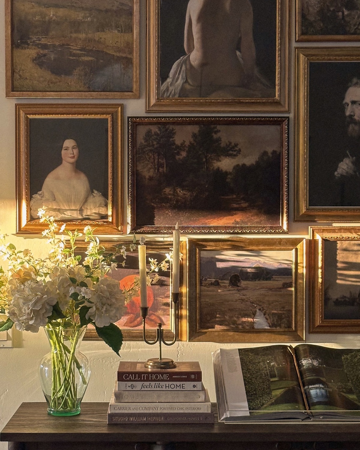
Cohesion does not come from matching. It comes from four things: keeping the artwork in one tonal family, keeping the frames in one metal family, spacing the frames in proportion to their size, and anchoring the arrangement with your largest piece in the center. The art itself can be completely unmatched.
In This Article
Why Gallery Walls Don’t Look Cohesive
Deciding on the layout is the hardest part of the process. There are so many elements to consider. Frame size and orientation, symmetry, balance, the color of the frames, the color of the artwork inside them. Making all of that look cohesive and still have visual interest is such a challenge.
That is the part nobody warns you about. It is not the hanging. It is that you can own twelve pieces you genuinely love, put them on a wall, and have the whole thing read as twelve separate decisions instead of one.
Most gallery wall advice solves a different problem. It tells you how to space and level and measure, which matters, but a perfectly level wall of mismatched art still reads as clutter. A gallery wall is a commitment in the same way an accent wall is, and it has to relate to the room around it rather than just fill space. Here is how I get a collected wall to read as one thing.
The Mistake I Made With My First Gallery Wall
I have changed out my entire gallery wall a few times, and it was always because I did not like the scale or the artwork. In the earlier versions I found something and threw it up because I wanted a gallery wall, instead of waiting until I had a collection that looked good together and enough pieces to fill the wall properly.
We have big walls. I never had enough frames, or the artwork was never large enough for the space.
That is the real lesson, and it is not a technique. A gallery wall is not a weekend project. It is a collection you assemble slowly and then install carefully.
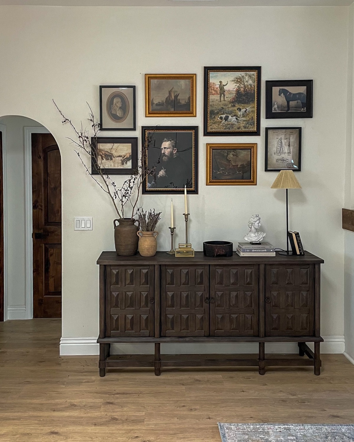
Before
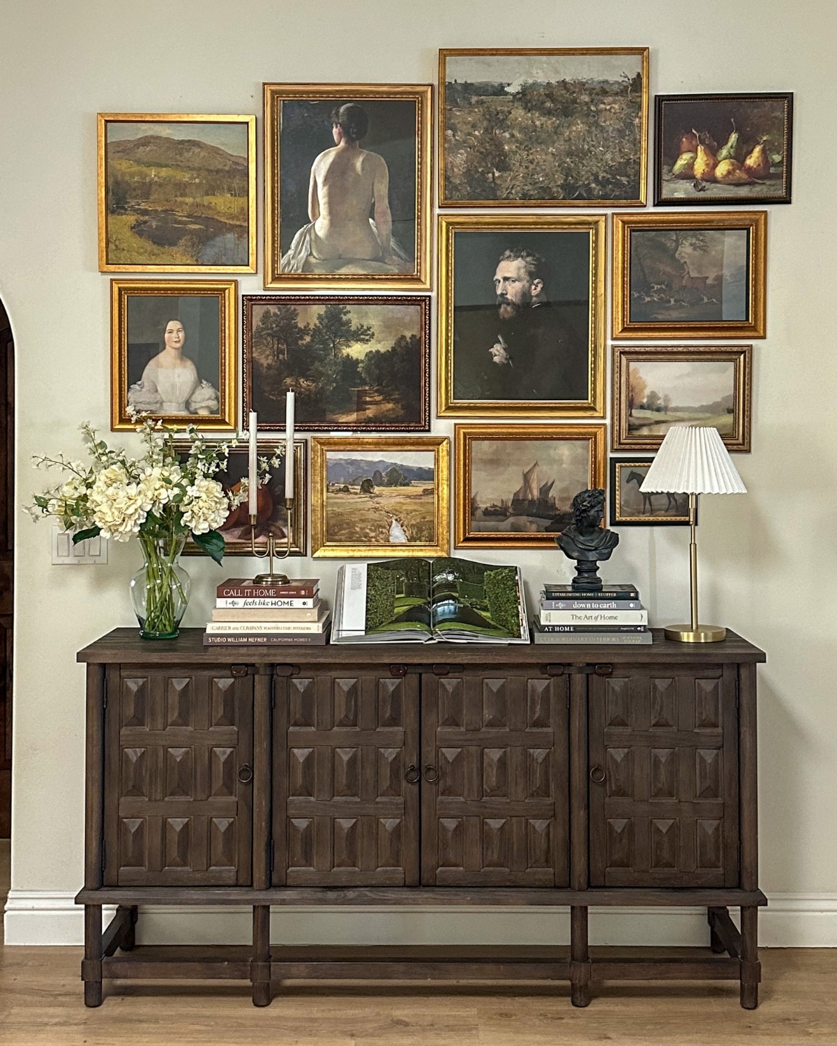
After
How To Choose Art For A Gallery Wall
Start With A Tone, Not A Wall
The first lever is tonal. If everything you buy sits in the same color family, the pieces will get along on the wall no matter how different the subjects are.
Art is subjective, and my answer will not be everyone’s. What I look at is color and composition. I am drawn to landscapes and traditional portraits, and if a piece has a warm tone, olive greens and creams and browns, I will probably end up buying it. Bonus if it comes in a gold or bronze ornate frame.
On subject, I keep returning to what I think of as old money hobbies. Hunting, equestrian, polo, rowing crew, nautical ships in a colonial sense, dogs and horses. East Coast Ivy League, very Ralph Lauren. I love how timeless and sophisticated that world is. The British version pulls me in just as much, the Cotswolds, the cottages, the old world European feel of it. There are some painted fruits I like as well, but landscapes and portraits are what I come back to.
Those subjects are unrelated to each other. A ship, a portrait, a bowl of pears, a dog. What holds them together is that they were all painted in the same range of warm, low-saturation color. That is the trick, and it is why the wall reads as a collection rather than an assortment.
Your range will be different. The instruction is not to like olive green. It is to pick a tonal range and be strict about it, because the alternative is a wall that fights itself. If you are still working out what your range even is, that is really a question about where to start with a room before it is a question about art.
Designer Tip
Art on the walls. Family photos on the tables.
If there is one rule that makes a room feel more elevated, it is this one. Keep your walls for artwork, and display your family photos in frames on consoles, mantels, and shelves instead. Family photos on a gallery wall pull every visitor into your personal life at eye level. The same photos on a sideboard read as warmth without taking over the room, and they leave the wall free to do the work of art.
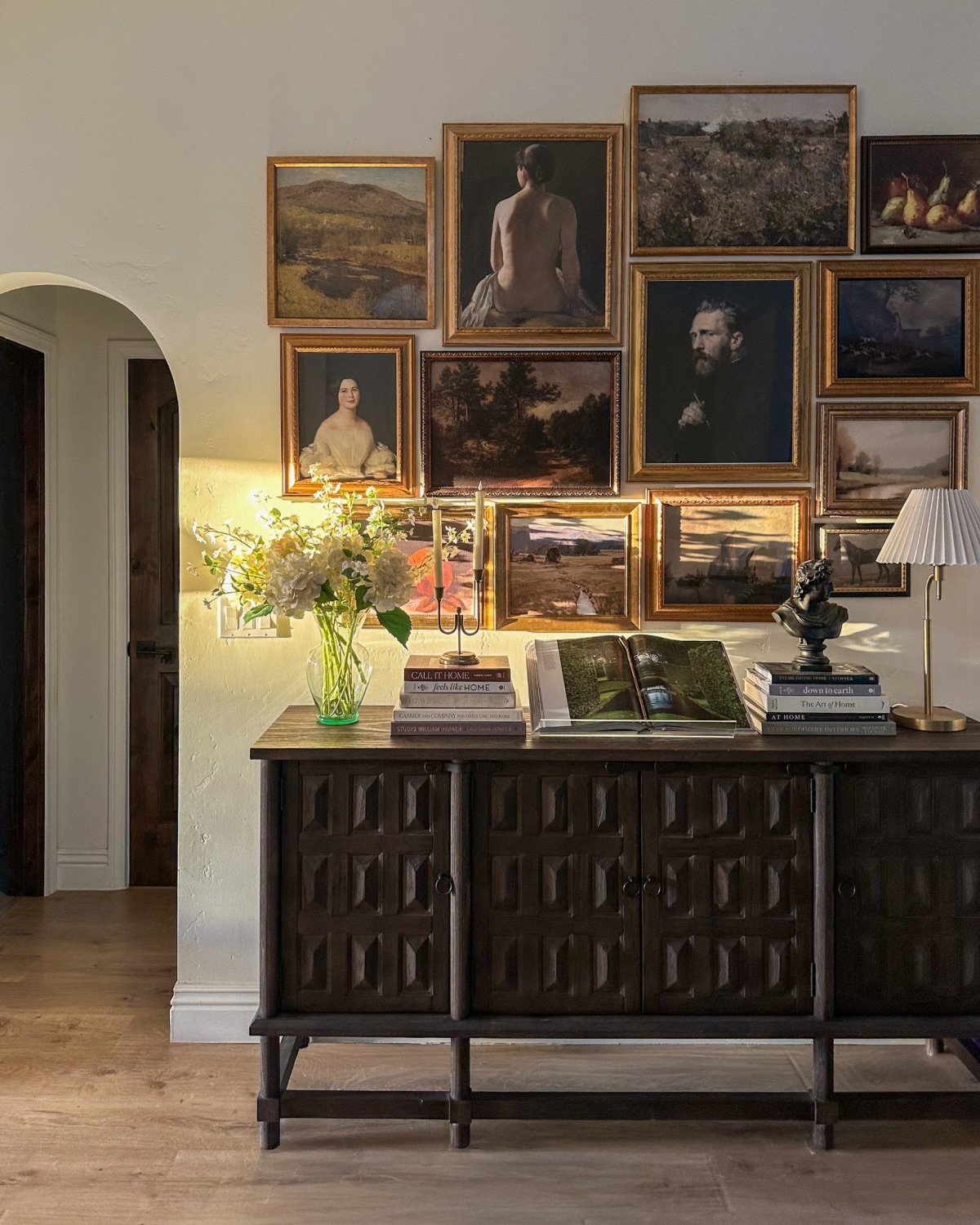
Where The Art Actually Comes From
I have replaced the artwork in my gallery wall many times. I love using digital art downloads and having them printed at my local print shop, then putting them in frames I already own. It means I can change the art inexpensively instead of replacing the whole frame.
Target and Hobby Lobby also have a great selection of framed canvas art, including the ornate frames and the oil painting style landscapes and fruit that I gravitate toward. So it ends up being a combination of the three.
That third source changes the economics of the whole thing. If the frame stays on the wall and only the print inside changes, refreshing a gallery wall costs a few dollars per piece rather than a few hundred.
One of my favorite pieces is a Van Gogh self portrait, which is a digital download. It is a famous painting, but what I love about this one is the contrast. The background and his jacket are black while his face and hands and hair are light, so they really stand out.
How To Print A Digital Download
Any local print shop works. I use Office Depot because it is closest to me, and Staples has a printing center as well. I print on regular photo paper, because my frames have glass fronts and the matte upgrade will not show through glass anyway.
If I am gluing the print to the frame backing and removing the glass, I upgrade to matte paper.
Make A Printed Download Look Like A Real Painting
This is the easiest way I know to turn a printed photo into something that looks like vintage textured artwork, and it is quick.
You need a printed photo, satin Mod Podge, a paintbrush, and a frame. Take the glass out of the frame and leave it out. Brush the satin Mod Podge over the front of the print in soft strokes, letting the brush marks show instead of smoothing them flat.
Those two things together, the visible brush strokes and the missing glass, are what create the painted texture.
If the frame needs help too, Rub n Buff will take a thrifted frame to something that reads antique. I used Grecian Gold on mine.
I filmed the whole process, so if it is easier to watch than read, the reel is here.
What Frames Work Best For A Gallery Wall?
Most of my frames are from Hobby Lobby. They are priced well, the color range is good, and they carry a lot of ornate options.
When I find a frame I love in a color I do not, I Rub n Buff it. It is the same trick I use on hardware, and it is how I ended up duping a designer look on our kitchen cabinets for a fraction of the price. Grecian Gold and Antique Gold are my favorites, though I have used most of the shades and they are all good. On my gallery wall I use a mix of gold and bronze tones.
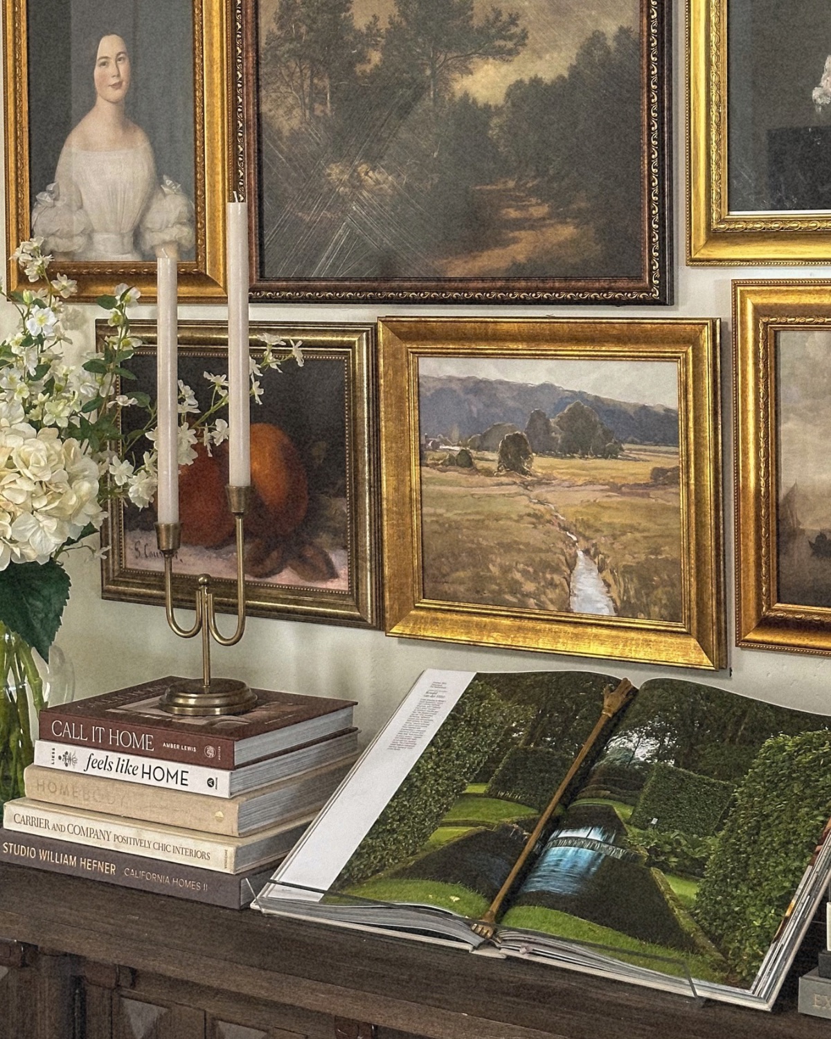
I lean toward antique style gold and bronze ornate frames because they carry more character and color than a wood tone or a black. I also prefer slightly thicker frames. They give the wall a more dramatic look and more dimension.
This is the second lever, and it works like the first. The frames are not identical. They are all in one metal family. Gold and bronze together read as a set. Gold and black and walnut together read as leftovers.
Do The Frames Have To Match?
There are two kinds of gallery walls. One where the frames match and one where they do not, and it depends on the look you want.
I prefer unmatched frames, because it gives you far more opportunity to collect. If you want something more symmetrical or more modern, go with matching.
If you do use matching frames with all different artwork, keep the art in the same tone. Getting everything in black and white is a great way to make that work.
Notice what that tip actually says. You need unity in either the frames or the art. Vary both and the wall stops holding together.
Shop The Frames
The frames, Rub n Buff shades, satin Mod Podge, and the pieces on the sideboard.
Should Gallery Wall Art Have Mats?
I do not use art with a mat on a gallery wall. It feels more cohesive when the art bleeds straight to the edge of the frame.
Given the choice I would take no glass front and matte paper, with the artwork running right to the frame. I do not like the white surround a mat creates. I also do not like unframed canvas art, so my ideal is real canvas art in a frame with no glass.
If you are going to use mats, keep the thickness and the color the same across every piece. Go all matted or none. Once you start mixing, it stops looking cohesive.
This is the third lever, and most guides get it backwards. A mat puts a band of white between the art and the frame, which separates every piece twice, once by the mat and once by the gap. Removing it lets the images sit closer together visually before you have moved a single frame.
How To Plan Your Gallery Wall Layout
Deciding on the orientation and setup is the trickiest part, because you are juggling so many frame sizes and orientations at once.
I approach it with some symmetry but not complete symmetry. If I have multiples of the same frame size or orientation, I build one side and then mirror that pattern on the other.
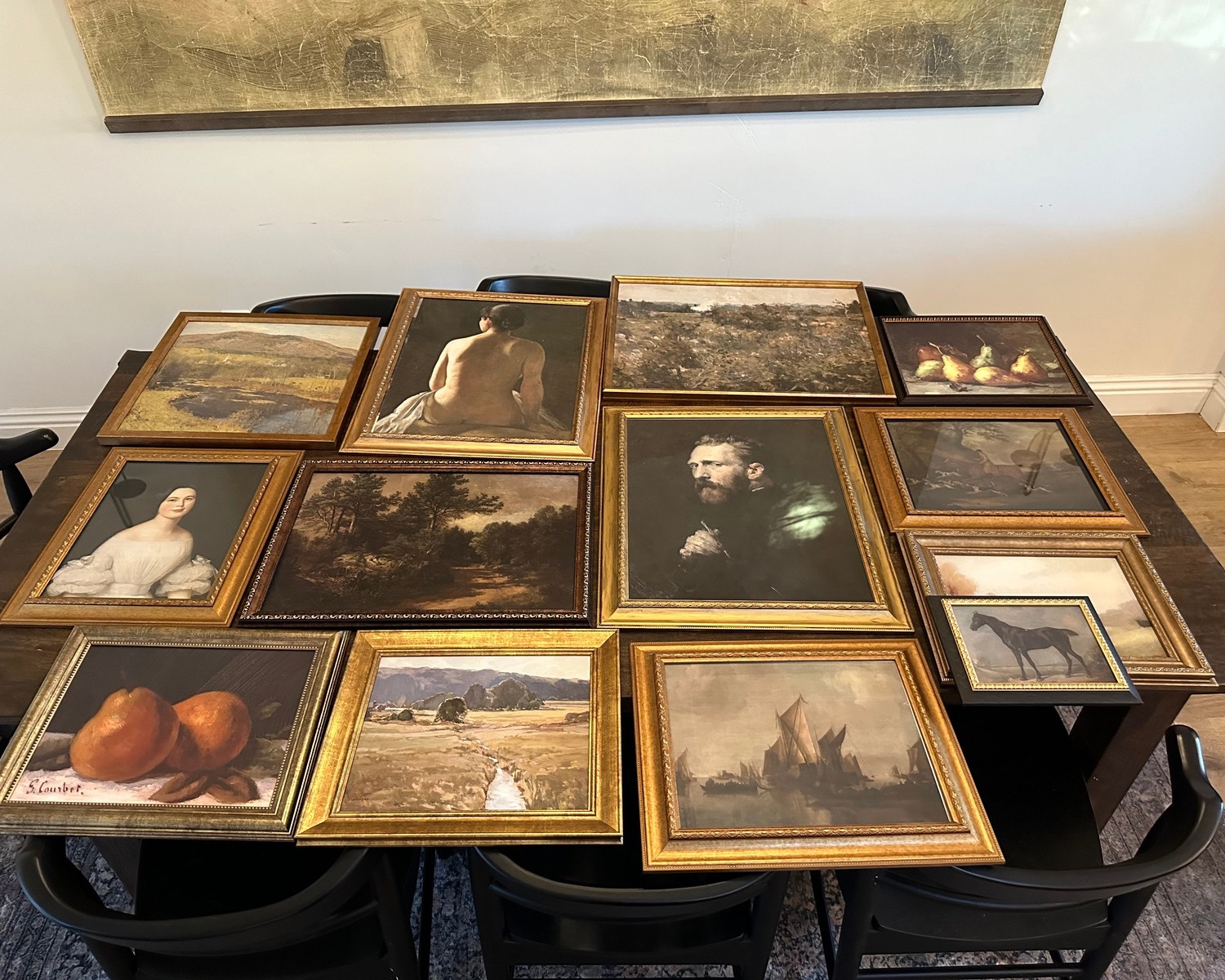
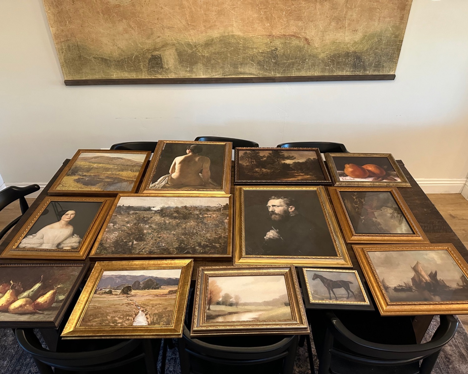
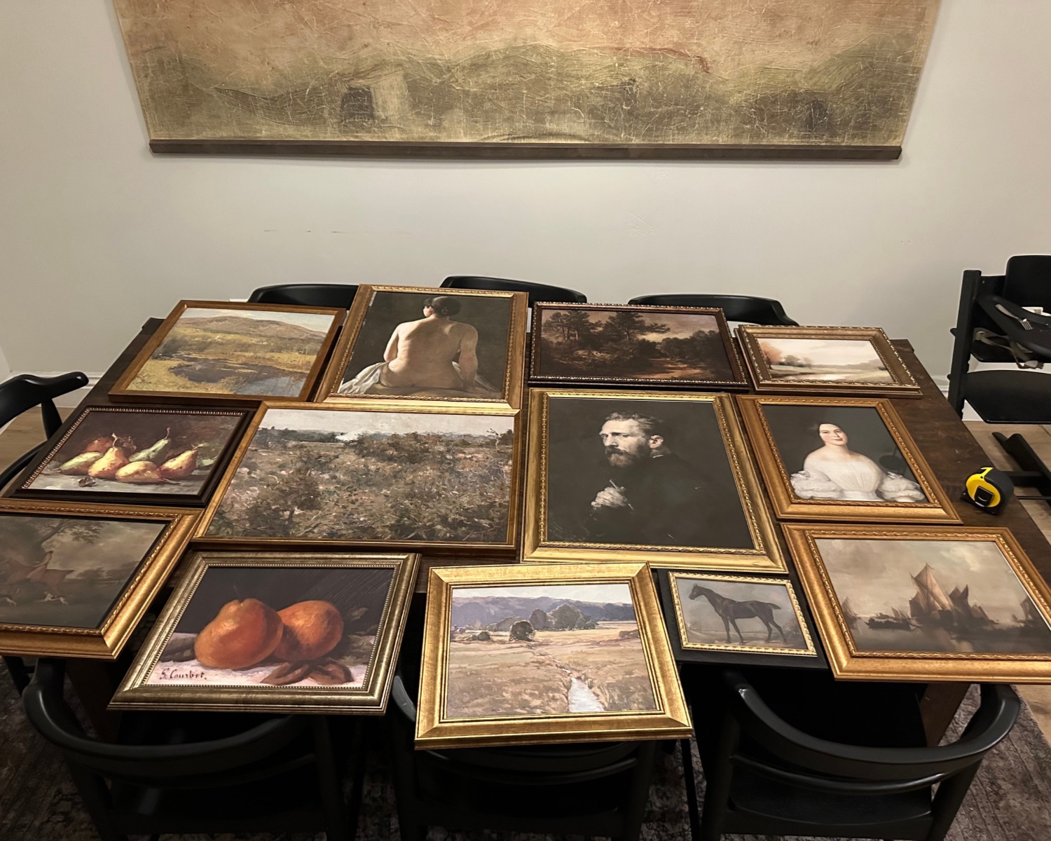
I lay everything out on the floor or a table and rearrange until I find a combination I like. Sometimes I have to stop and wait until I find another piece in a specific size to fill a gap or even things out. My most recent version sat on the table for a full day while I kept coming back to it.
I also photograph the layout and bring it into Canva. I upload a blank photo of the wall and layer the pieces in, which lets me see whether everything is in a good spot and whether the artwork works together before anything goes up.
Two things there are worth separating out. A day of rearranging is normal, not a sign you are doing it wrong. And being willing to leave a gap unfilled until the right size turns up is the difference between a wall that looks collected and one that looks finished under duress.
Option 1
Option 2
Option 3
How To Hang A Gallery Wall
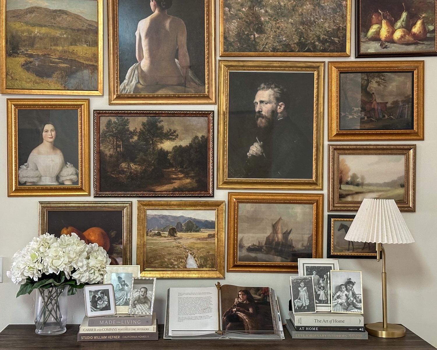
I hang the largest pieces in the center first and work my way out. It makes spacing much easier and keeps everything centered.
Measure the total height and width of the whole arrangement, including the spacing, and mark that on the wall before you start.
Add a single sawtooth hook to the back of each frame to make them easier to hang.
How Much Space Should Be Between Frames?

On my previous gallery wall I left about 2 inches, which was way too much for what I had up there. I prefer the pieces much closer together. My most recent version sits somewhere between half an inch and an inch.
Designer Tip
Scale your spacing to the size of your frames.
The larger the frames and the larger the artwork, the more spacing you can get away with. If you are working with smaller pieces, tighten it up. At the end of the day, use your discernment. There is no single number that works on every wall.
That is why the standard guidance, which usually lands between one and a half and three inches, can look wrong on a particular wall. The number is not the point. The ratio is. A gap that reads as breathing room around large canvases reads as a gulf between small ones.
Line Up The Frames, Not The Hooks
What I learned from the first go round is to line up the frames, not the hooks. You are working with different frame sizes, thicknesses, and orientations, so keeping everything tight and level and aligned matters more than where the hardware sits.
That distinction is easy to miss and expensive to discover. Hooks sit at different depths and heights depending on the frame, so a row of perfectly measured hooks can produce a row of visibly uneven frames.
If You Are Nervous About The First Hole
Use Command hooks. It is an easy way to test something before drilling. Live with it for a while, see what you would change, and once you love it you can drill and make it permanent.
How To Style The Table Below Your Gallery Wall
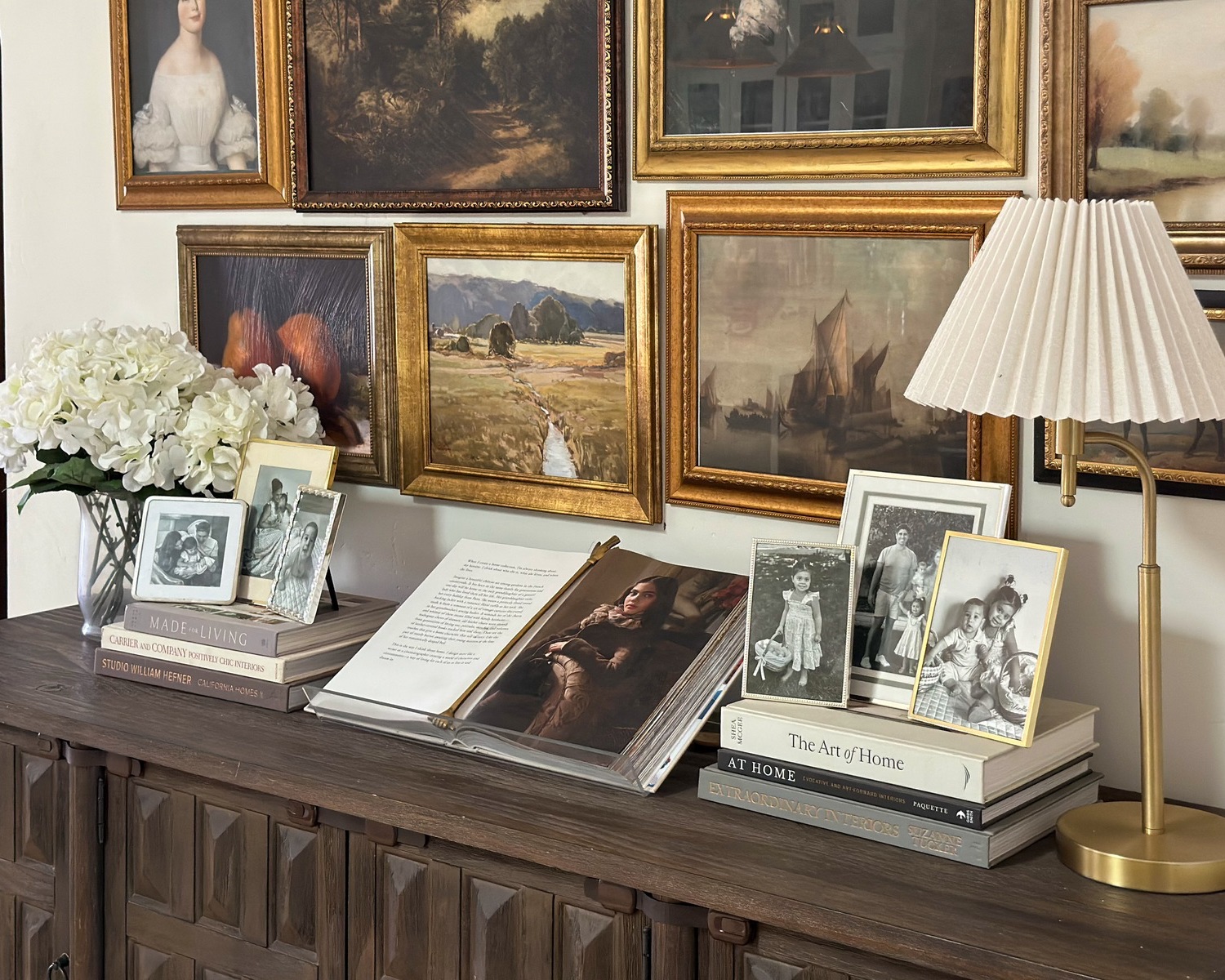
The sideboard is one of the things I get asked about most. It is from Living Spaces, from the Nate and Jeremiah collection.
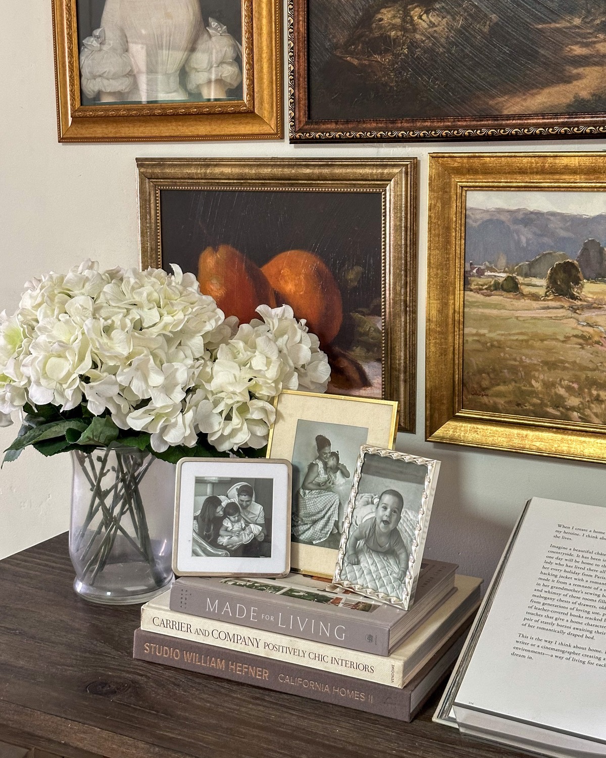
I style it with coffee table books, flowers, a lamp, a bust, and candles. I have so many books and I love displaying them. Right now there are stacks of them with framed family photos on top, plus one open on a raised tilted display so I can change the page.
I use faux flowers rather than fresh. I do not have the capacity to keep buying and maintaining real ones, and I do not like that they drop petals my kids can pick up. Most of my faux stems come from Afloral or Hobby Lobby, and right now it is hydrangeas. I do the same thing outside, where almost everything on our shaded front porch is faux for the same reason.
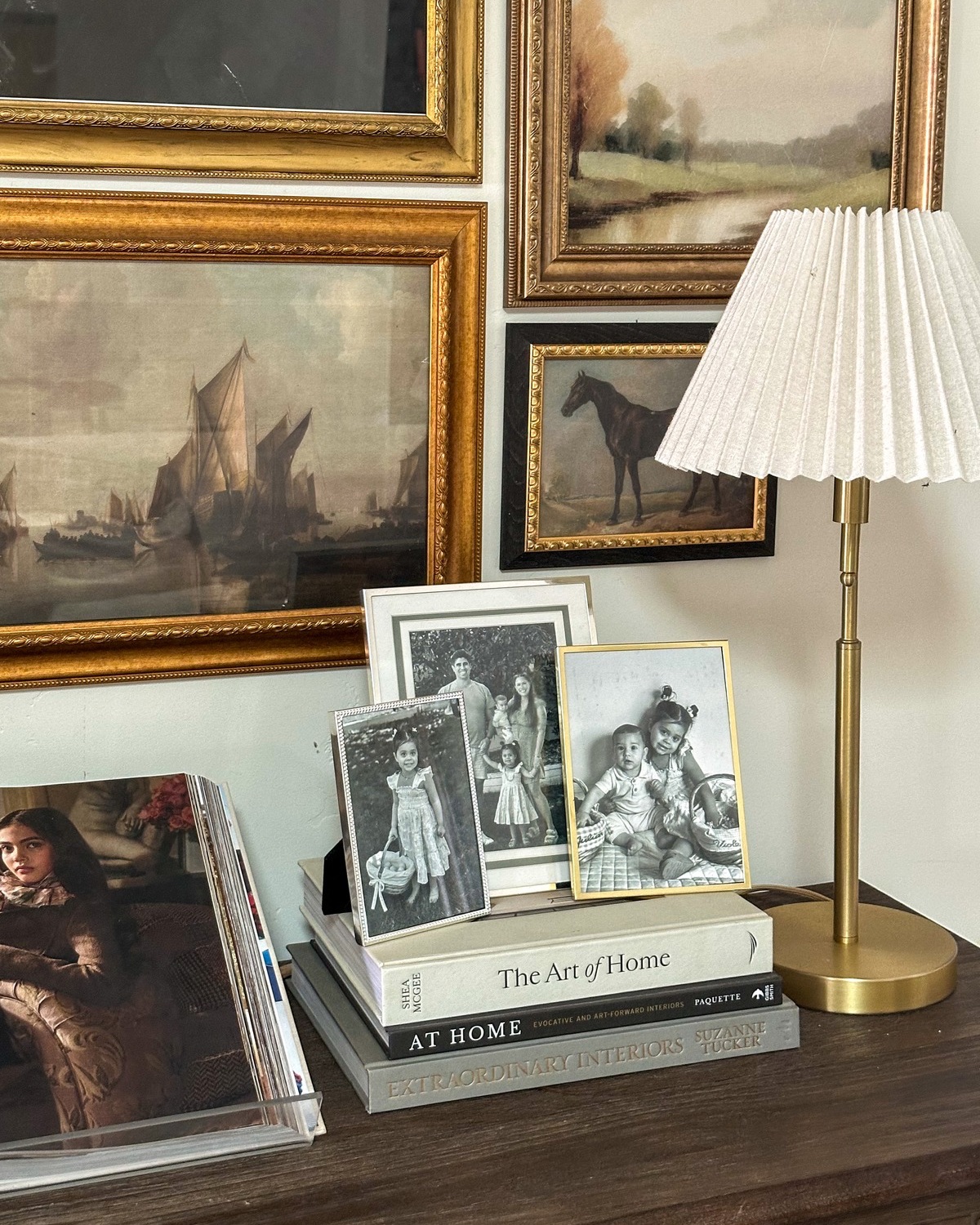
Designer Tip
Print your family photos in black and white.
I recently started collecting frames in polished nickel, silver, and gold, and printing my family photos in black and white so everything stays cohesive.
Color photographs carry whatever was in the room the day they were taken. A red shirt, a green lawn, the blue of a pool. Convert the group to black and white and those competing colors disappear, which means you can mix frame metals freely and the collection still reads as one set. Same tonal logic as the wall above, applied to photographs.
Once I find something I love I leave it alone for a long time. I have not changed my current sideboard in a while, and with the family photos on it I probably will not. The flowers change with the season, and at Christmas I swap things out properly, but otherwise I do not rotate tabletop decor much.
FAQ
How much space should be between gallery wall frames?
Scale it to your frames. The larger the frames and artwork, the more spacing you can get away with; with smaller pieces, tighten it up. Most guidance says one and a half to three inches. I ran two inches on my previous wall and it was way too much for what I had up there, and my current one sits between half an inch and an inch. Use your discernment, because no single number works on every wall.
Should gallery wall art have mats?
I skip them. A mat puts a white band between the art and the frame, and on a gallery wall that extra separation works against you. If you do use mats, keep the thickness and color the same across every piece. All matted or none, never mixed.
Do gallery wall frames have to match?
No, but something has to. If your frames vary, keep the artwork in one tonal family. If your artwork varies, keep the frames matching. Unmatched frames give you more freedom to collect over time, which is what I prefer.
What is the cheapest way to get gallery wall art?
Digital art downloads printed at a local print shop, in frames you already own. Any print shop works. I use Office Depot. It lets you change the art without changing the frames.
How do you make a printed download look like a real painting?
Print it, take the glass out of the frame and leave it out, then brush satin Mod Podge over the front of the print in soft strokes so the brush marks show. The visible texture plus the missing glass is what sells it.
Should family photos go on a gallery wall?
I keep mine off the wall. Walls are for artwork, and family photos go in frames on the sideboard and the mantel instead. It makes a room feel more considered and keeps the gallery wall doing one job. Print the photos in black and white and you can mix frame metals while the group still looks cohesive.
Which piece do you hang first?
The largest, in the center, then work outward. It keeps the arrangement centered and makes spacing much easier to control.
Shop The Look
Frames, Rub n Buff, satin Mod Podge, faux stems, and the pieces on the sideboard.